ROLLIN Concierge launched on the App Store in April. We pushed it fast because we wanted to start a conversation, not because we thought we had it all figured out. We had a clear thesis going in: we are against the checkbox approach to accessibility, and we wanted to build something that surfaced the data differently. What we did not yet have was a confident answer to the question that mattered most: how should a user actually interact with this data?
The month after launch was the answer. Users told us where the experience worked and where it did not. They told us what they wanted to control and what they wanted to delegate. They told us, mostly between the lines, that the app could not look the same for everyone if accessibility itself does not look the same for everyone. The new release is the rebuild that came out of taking that seriously.
Accessibility data is only useful if the way users interact with it is itself accessible to them.
Personalization runs the app now
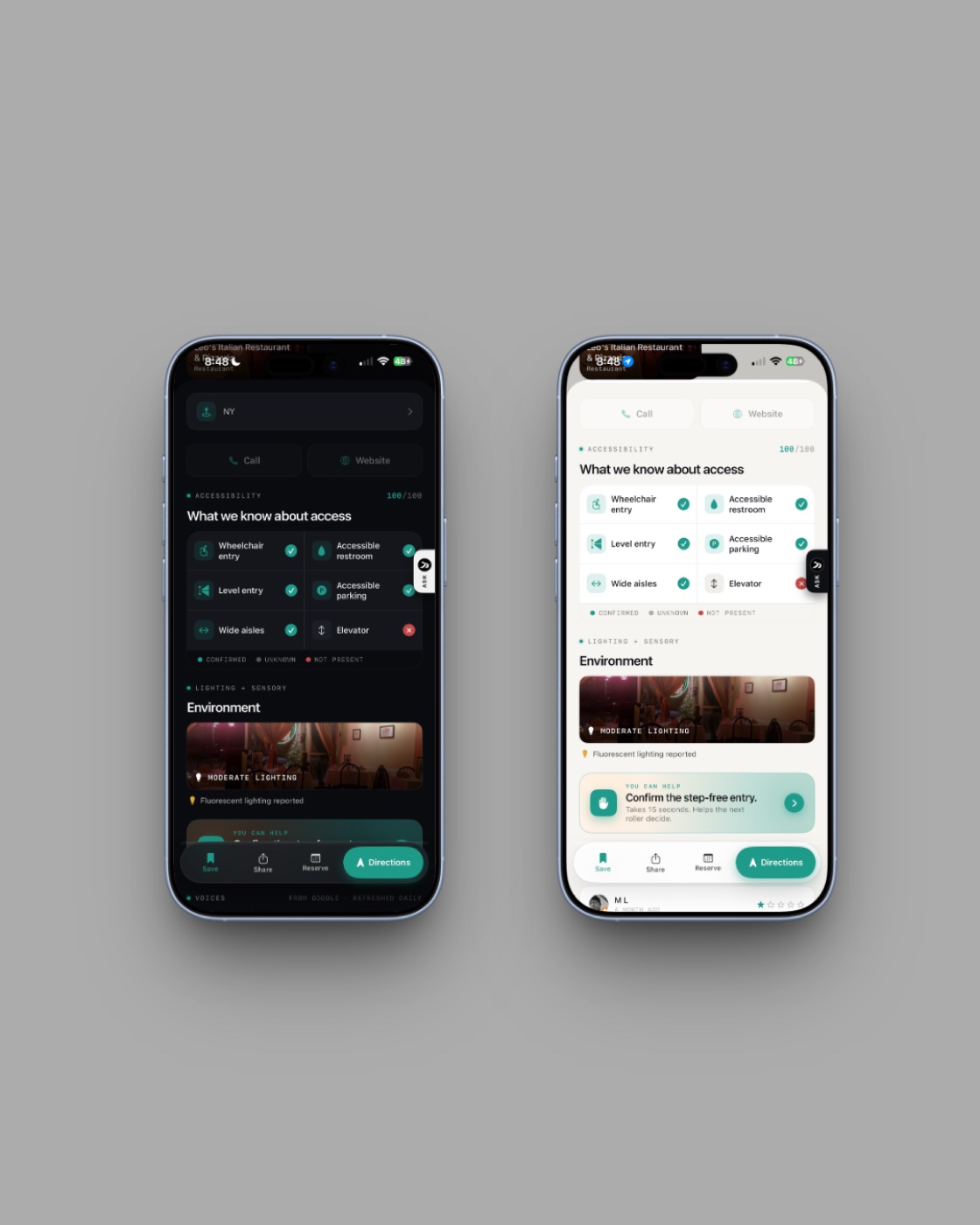
The biggest single change in the rebuild is that personalization is no longer a settings page someone has to find. It is the top of the app. A global toggle sits at the top of Home and at the top of Map, with two labels: For me and All places. Flipping it on one screen flips it on the other.
When you onboard, the app asks you what you want. Your access needs. The cuisines you actually like. The venue types you actually visit. The price tier you operate in. The concierge mode that fits your tempo. We use those answers immediately, on the first screen you see after onboarding. With the toggle on For me, every feed in the app is filtered and ranked against those preferences. With the toggle on All places, you get the raw scored map, the way a traditional accessibility map presents it — the right answer when you are traveling somewhere new and want every option visible at once.
The more you use the app, the better the match gets. The places you save, the thumbs you give, the feature confirmations you submit, the venues you return to — all of it is signal. If you visit a coffee shop three times a week, the app understands that it is a top spot for you and starts surfacing similar ones. ROLLIN Concierge builds the personalization layer with you, over time, as you actually move.
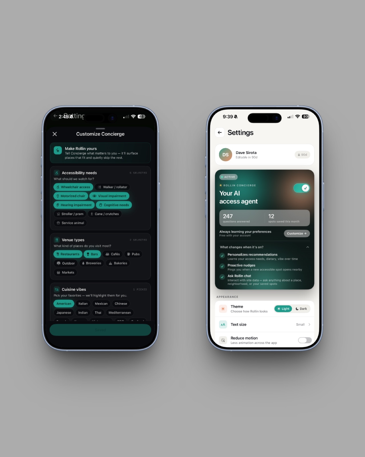
You decide how the app looks at you
The original release shipped with a single dark UI that the team thought was the right default. The community told us, politely but clearly, that we had decided something we should have asked. Some users prefer dark. Some users find dark harder to read in bright environments or with certain low-vision conditions. Some users want a larger text size than the iOS system size. Some users want less motion.
The new release gives all of that back to the user. You pick the theme. You pick the text size, and the size you pick now actually cascades through every tab root and every card variant — the size you choose is the size you get app-wide. You choose how much the app speaks and how often it pings you. You decide which environmental signals you care about. The interface is yours to shape, and the app respects the shape you give it.
Ask Rollin reads only what ROLLIN already knows
Most apps adding AI in 2026 are bolting a chatbot onto their existing interface. That approach is wrong for accessibility, because a generic chatbot has no idea whether a venue actually has step-free entry. It knows whatever someone wrote about the place on the open internet, which is exactly the problem we built ROLLIN to solve in the first place.
Ask Rollin is built differently. It is an assistant on every venue page in the app, and you can ask it natural-language questions. Is there step-free entry. Is the bathroom accessible from a wheelchair. Can a power chair turn around inside. Should I trust this score. Has anyone reviewed this in the last month. Every answer is grounded in the data ROLLIN already holds for that venue. Ask Rollin cannot hallucinate an accessible restroom because we have not confirmed one. If the data is unknown, it says so.
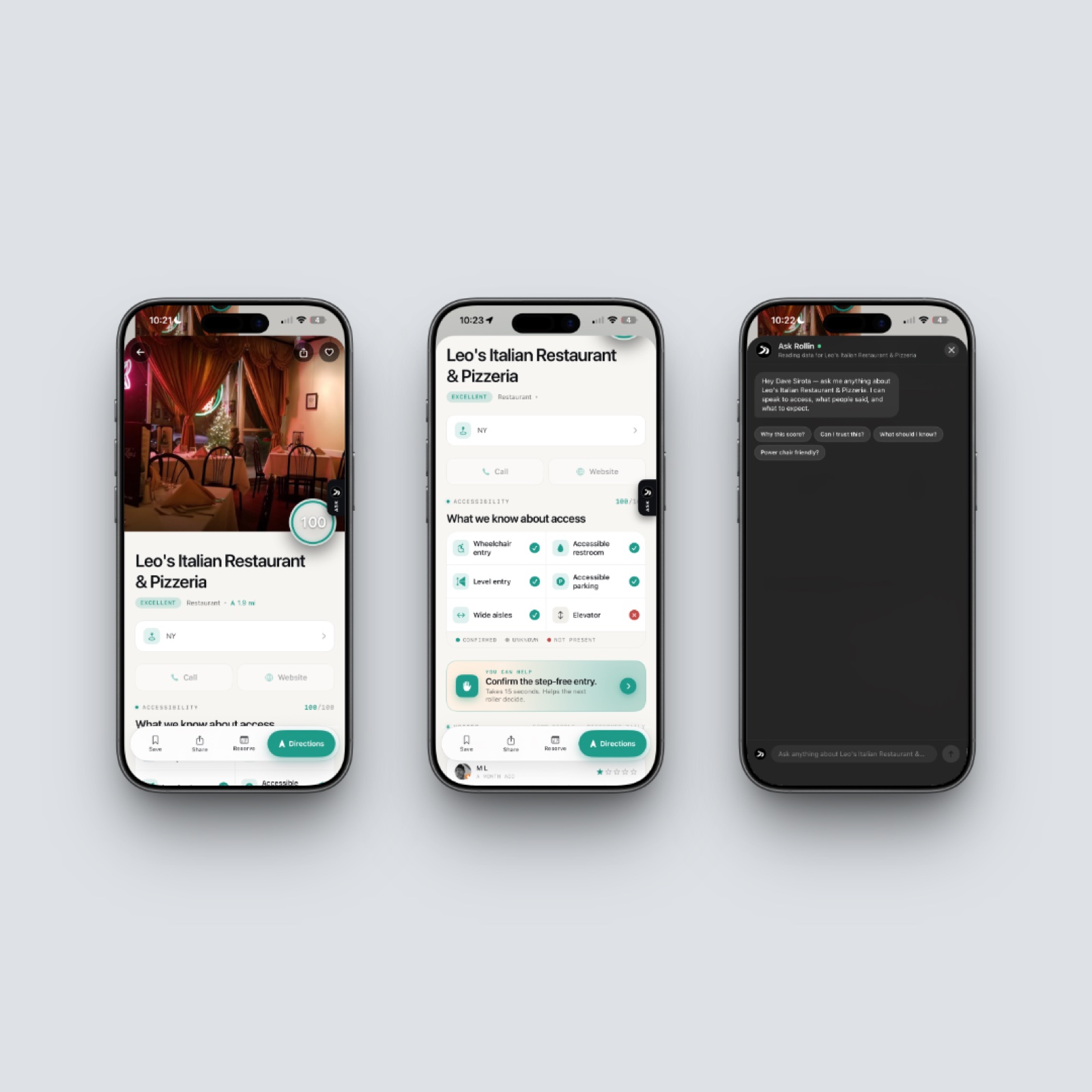
Ask Rollin can only say things you could verify by reading the same venue page yourself.
The map carries more weight here than anywhere else
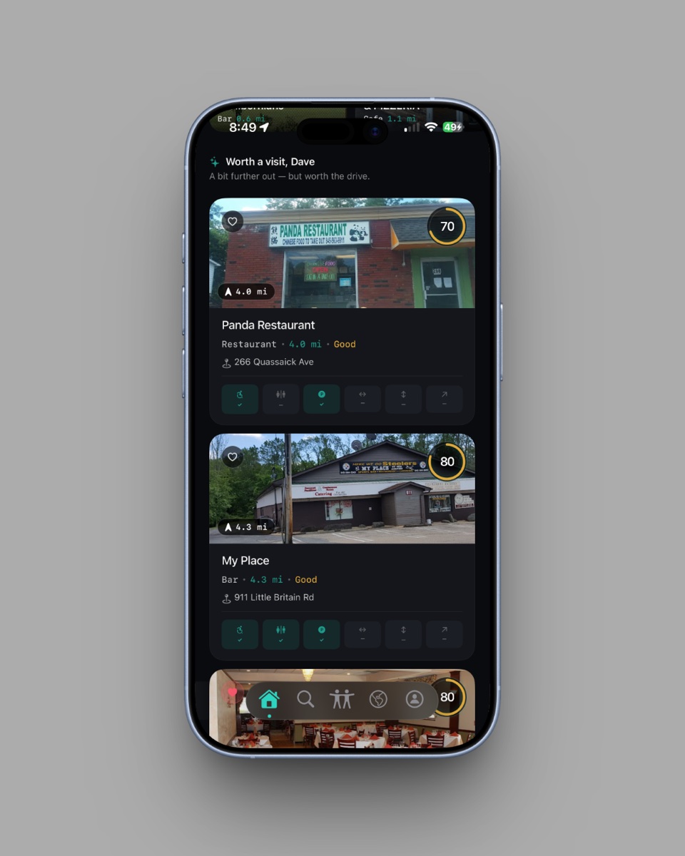
The original map was the part most people complained about politely, and we put real time into rebuilding it. There is a reason the map matters disproportionately in an accessibility app: people are not looking for the closest restaurant. They are looking for the closest restaurant they can actually enter. The map needs to show that distinction at a glance.
The cube button in the top right swaps the standard view for Apple’s 3D Flyover, which shows actual building geometry rather than a flat road grid. Satellite is an independent layer. Tapping the search bar opens a full-screen overlay that behaves like Apple Maps’ own search, with photo thumbnails and a circular accessibility score ring on every result. The map auto-refreshes as you move, capped to a 500-meter movement threshold and a 30-second rate limit so that staying current does not burn your battery.
The card system was rebuilt around a single principle: the accessibility score has to be legible from anywhere, on any backdrop, in any theme. The score ring adapts its color to whatever sits behind it. The number is the most important pixel on the card, and the new release treats it that way. Three card variants — a motion-responsive HeroCard, a content-forward FullCard, and a CompactCard for carousels — give the score the right amount of weight in different contexts.
New environmental signals, starting with lighting
The six wheelchair-relevant features ROLLIN was built on are still the spine of the score. But access is not only about wheelchair access. The new release introduces lighting as a measured environmental signal: users can report how bright a venue is, which matters for low-vision visitors, autistic visitors, and anyone whose day is shaped by fluorescents and glare. Sound is the next signal we are adding — how loud a venue actually is, when you actually go.
There is more on the roadmap that we are not ready to name yet. The point of mentioning it here is that we are a small enough company that what we ship next is partly your decision. We listen. The first release changed in real ways because users told us what to change. The next ones will change in real ways for the same reason.
What the CERTIFIED badge is actually doing
Two weeks ago we launched ROLLIN Certified, a reviewed credentialing program for venues that take accessibility seriously. The moment a venue completes Stripe checkout for either The Seal ($19 per month) or The Concierge ($49 per month, for hotels), a gold CERTIFIED badge appears on its card and place-detail header in the app automatically. No app update required. No manual switch.
The badge closes a loop that has been open for a long time. A venue invests in accessibility. The program verifies the investment. The badge appears on every user’s screen inside the app. The user walks in. The venue gets economic evidence that the investment paid off. The loop existed before in pieces; the new release is what makes it visible at the point of decision.
Restaurants are where ROLLIN started
ROLLIN is an accessibility tech company. Restaurants are where we started, because the data was the worst and the daily friction was the highest, but the work is bigger than that. The app is a portal into accessible living: restaurants today, and the rest of the way our users move through the world next. Hotels. Lodges. Parks. Paths. Outdoor spaces. The CERTIFIED program is already expanding into hospitality. The map and the score are designed to absorb new signals as we add them. The rebuild was about cleaning up the interface, and it was about building a foundation we can keep extending without starting over.
The next launch on our calendar is the Cornwall: First Accessibility-Intelligent Town pilot, a six-month municipal partnership with the Town of Cornwall, New York. Cornwall becomes the first town anywhere in New York State to put scored accessibility data directly into residents’ and visitors’ hands, and ROLLIN goes live there before the July 4 weekend. After Cornwall, more cities. After cities, more partner venues. After partner venues, more of the surfaces our users actually touch in a day.
Accessibility is what we do. This is the version of ROLLIN Concierge that finally feels that way.
Get it
The new ROLLIN Concierge is on the App Store today. Download for Free. If you already had the original installed, the rebuild will arrive as a free update through the App Store.
If you do not use an iPhone, the entire ROLLIN platform is free on the web at joinrollin.com. It always has been, and it always will be.
And if you have a feature you wish was in the app — sound, transit, sensory, anything — tell us. The rebuild exists because the people who tried the first release made it.